The paint chip looks lovely beside an oak cabinet door. Then you hold it above the countertop, and suddenly one of them looks pink.
That is why choosing wall color for honey oak starts with more than the wood. The cabinets, counter, backsplash and floor are already a palette. Your wall color is joining a group that has opinions.
Start with the countertop background
Look at the broad color you see from across the room, not the tiniest fleck in the stone. Is the background cream, beige, white, gray or nearly black? Does it have an obvious pink, green or gold cast?
Move a plain white sheet beside it to make those differences easier to notice. Paper is a comparison aid, not a color-calibrated test.
Then place a prospective wall sample upright at the counter edge, where the painted wall will actually meet it. A pale neutral can look different next to another pale surface than it does floating in your hand.
Sherwin-Williams' guidance on undertones recommends comparing colors instead of assessing them in isolation, and checking the effect of natural and electric light.
The countertop is the first test because it gives you another fixed surface right beside the walls. The backsplash or a large expanse of flooring may still overrule it.
Choose a color family from the finishes you are keeping
Use these as starting points for samples. “Honey oak” describes a range of yellow, gold and orange-brown finishes, so no row guarantees a match.
| Existing countertop | Sample first | Reject or reconsider if |
|---|---|---|
| Cream or warm beige background | Soft warm off-white; a light beige related to the counter | The counter looks dingy beside the sample, or the wall becomes much yellower than intended |
| White with cool gray detail | Restrained off-white; pale greige with little obvious yellow | Cream looks yellow against the counter, or gray looks icy against the wood |
| Black or charcoal | A light neutral compatible with the backsplash; muted green for deliberate color | The candidate suits the dark counter but clashes with tile or makes the room darker than you want |
| Busy brown, gold and cream stone | A quiet light neutral drawn from the broad background | The wall magnifies a small pink, green or gold fleck you do not want to emphasize |
| Clearly pink-beige or colored laminate | A related restrained neutral tested directly at the edge | A fashionable green or cool white makes the fixed color look more pronounced than you like |
Cream or beige counters: keep the light colors connected
Begin with a restrained warm off-white or light beige. Compare it with the counter's background and the cabinet, then step back far enough to see both.
The aim is a compatible difference, not an exact match. A wall that echoes the counter's warmth can make the wood feel like part of the room rather than its only warm surface.
Watch the amount of yellow. A creamy counter, golden oak and a strongly yellow wall can add up to more warmth than you wanted. A quieter sample may work better than going abruptly to a cold white.
White or gray counters: check how much cream the room can take
Try a less creamy off-white or a pale, restrained greige. Hold it beside the counter's white background as well as any gray detail.
If the wall sample looks distinctly yellow beside the counter, test a less yellow option. If it looks blue-gray beside the cabinet, decide whether you enjoy that contrast or want something quieter.
The useful middle ground is often subtle. You are looking for a wall that connects the finishes without pretending the warm wood and cool counter are the same color.
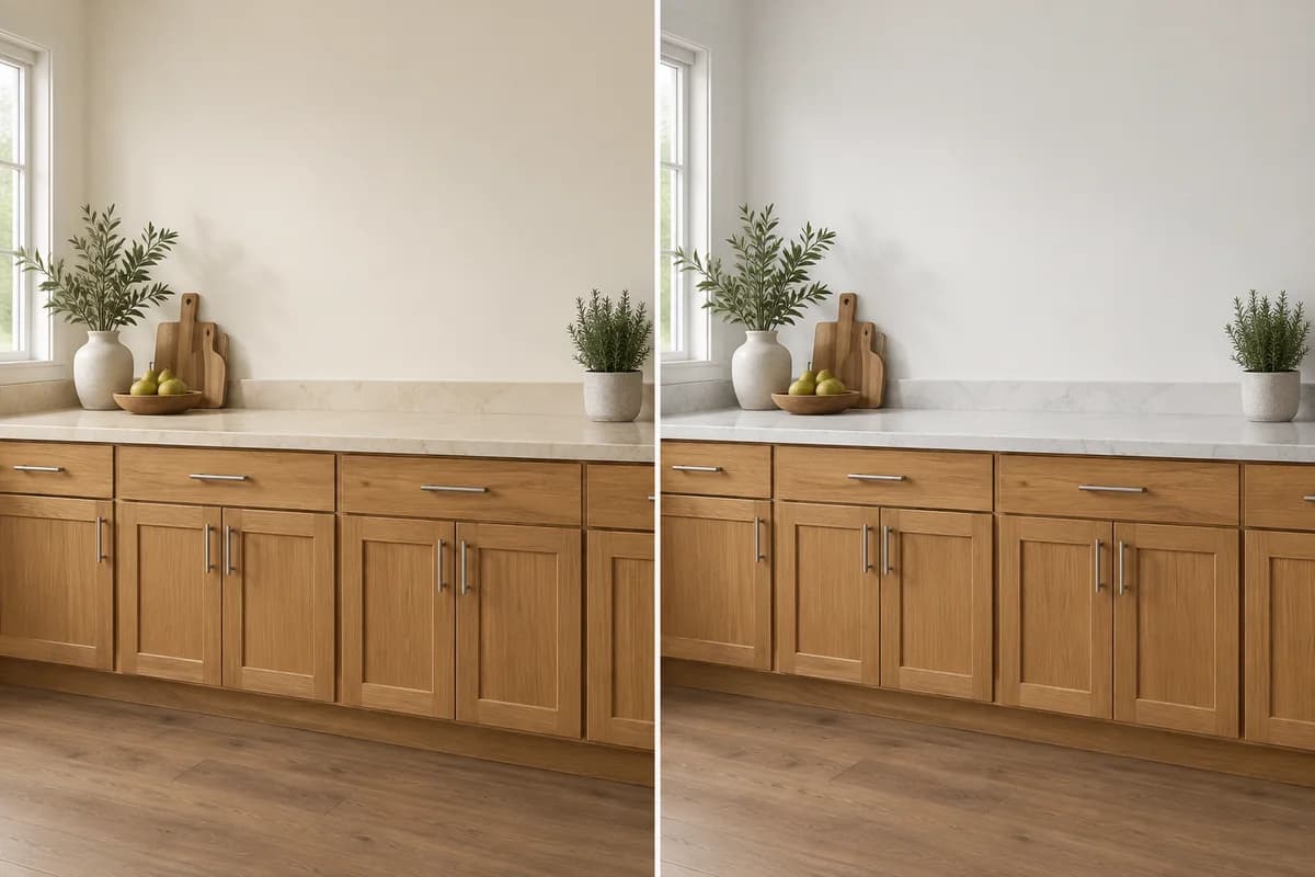
Conceptual examples: a creamier counter supports a warmer wall on the left; a cooler white counter supports a less creamy wall on the right. The oak stays the same. These are palette directions, not paint-color previews.
Dark counters: let the backsplash help choose the wall
A nearly black counter can work with several wall families. That makes the lighter surfaces more useful for narrowing the choice.
With cream tile, test a related light neutral. With gray-white tile, test a less creamy one. For more color, consider a muted green that also sits comfortably beside the floor.
A dark wall is an option if you want an enveloping room. Compare a large sample before committing, especially if the cabinet and counter already occupy most of the visual space.
Busy stone: give the pattern some quiet company
Choose a wall candidate related to the broad background, not every small color in the counter. A tiny gold or pink fleck can become surprisingly prominent when a whole wall repeats it.
Keep the wall fairly simple while you test. The grain in the oak and the pattern in the counter are already doing plenty.
Give the floor and backsplash a veto
Once a sample works at the counter, move it.
Hold it beside the backsplash, then low on the wall near the floor. View it from the doorway too, where the surfaces appear together rather than as isolated samples.
A pink-beige tile floor may reject a greenish neutral that looked calm above a cream counter. A cool gray floor may make a yellow wall feel more separate from the room. Those are reasons to compare another sample, not reasons to replace a floor you intended to keep.
If the kitchen opens into another room, check the wall color against that room's visible finishes as well. The kitchen does not end exactly where the cabinets do.
Decide whether the wood should blend in or stand out
For a quieter relationship, test a light neutral with compatible warmth. Keep enough light-dark difference that the room does not become one continuous beige surface.
For deliberate contrast, test a muted green or blue-green. Against that cooler wall, golden wood can become a more noticeable feature.
This is the difference between balancing the room and making the cabinets look less orange. A cooler wall can help the first while doing the opposite of the second. Paint beside the oak does not remove color from its finish.
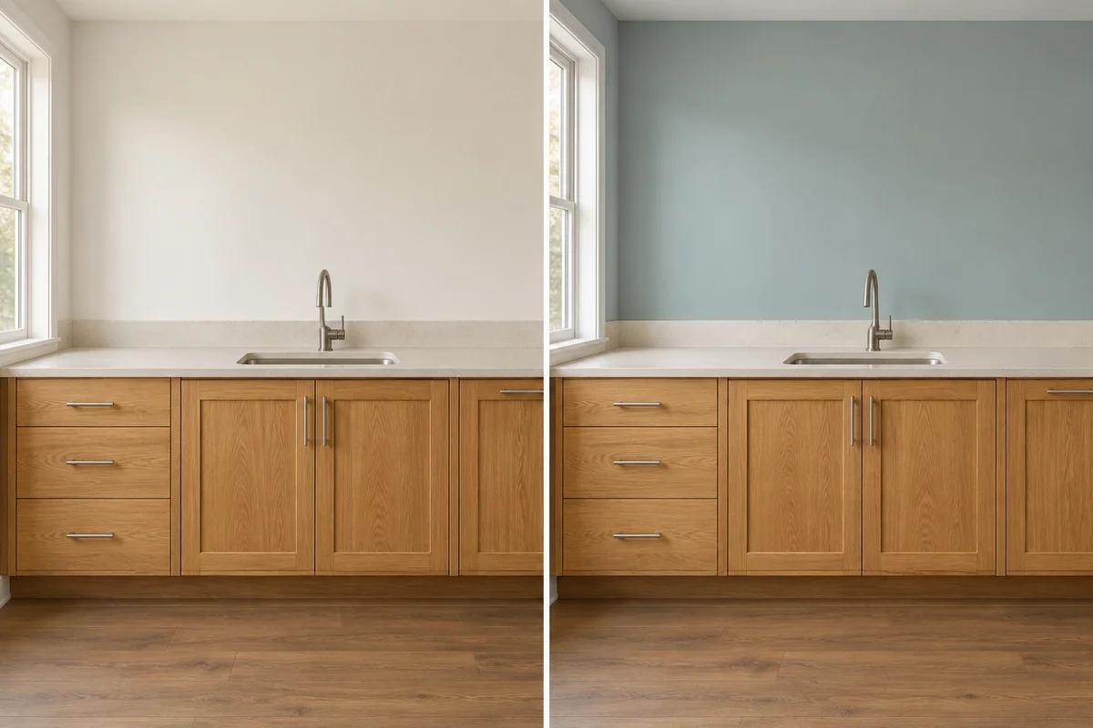
Only the wall color changes: warm off-white makes the relationship quieter; muted blue-green makes the same warm wood more distinct.
If your first reaction is “I see the cabinets before anything else,” decide whether that is the result you wanted. A coordinated palette can still attract more attention to the wood than you prefer.
Test three candidates in the actual kitchen
Choose three samples with a purpose: your strongest neutral, a slightly different neutral and a muted color if you want that option. This makes the comparison more useful than collecting ten nearly identical whites.
Use large physical samples prepared according to the paint maker's directions. Check the intended wall paint and finish before the final purchase; an on-screen room or printed swatch cannot settle that choice. Move them beside the counter, tile and floor. Leave enough space between samples to judge each individually.
Check them in daylight and again with your usual evening lights on. Keep the lights you normally use during cooking and dinner; the room needs to work then too.
Write down the specific problem when you reject one: too yellow beside the counter, pink near the floor, too dark at night. That gives the next sample a job.
Frequently asked questions
Does gray paint work with honey oak cabinets?
It can. Compare the actual gray with your countertop and floor: a beige-leaning or restrained green-gray may fit some rooms, while a blue-gray may create stronger contrast with the warm wood. The word gray alone is not enough to choose.
Will blue or green paint make honey oak look less orange?
It can make the overall palette feel cooler, but the contrast may make the oak's warmth more noticeable. If your goal is quieter wood, compare a restrained warm neutral as well as the blue or green. Judge the full room, not just the paint chip.
Can I use white walls if my countertop is cream?
Yes, but test the two whites directly together. A very crisp wall white can make a creamy counter look more yellow by comparison. A softer off-white may connect them better, provided it also works with the backsplash and floor.
What if my counter and floor have different undertones?
Look for a restrained wall color that works beside both instead of matching one exactly. Test it where the wall meets the counter and again near the floor. If no sample works, decide which visible finish dominates the room; paint cannot make incompatible fixed materials identical.