Sage green is agreeable until every cream sample beside it turns yellow and the gray sofa suddenly looks purple.
The paint is not being difficult. It has an undertone.
Read the green before choosing the room
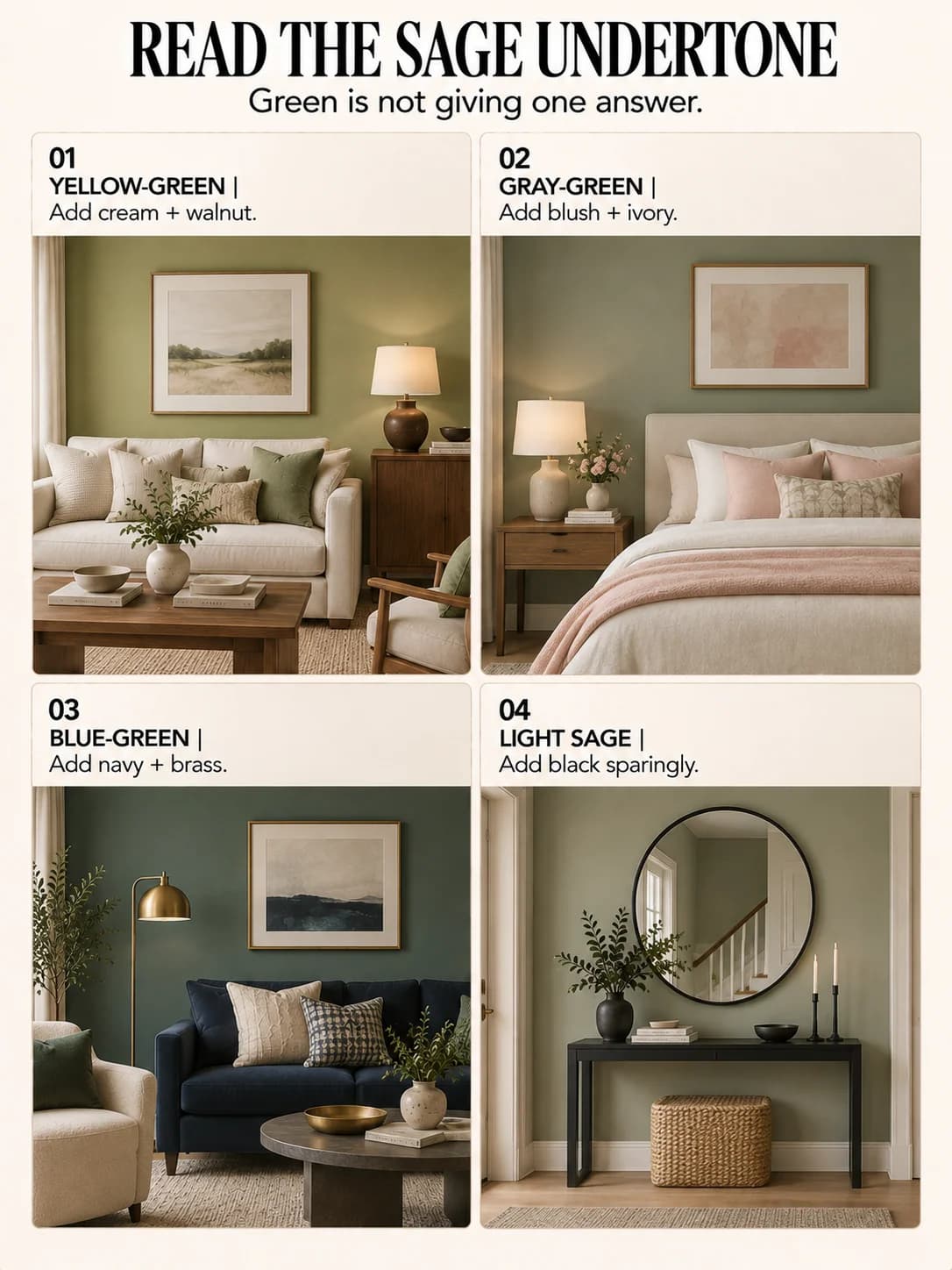
Place a sheet of white paper beside the wall. Does the sage look yellow, blue or noticeably gray? Then check it in morning light, late afternoon and with the lamps on.
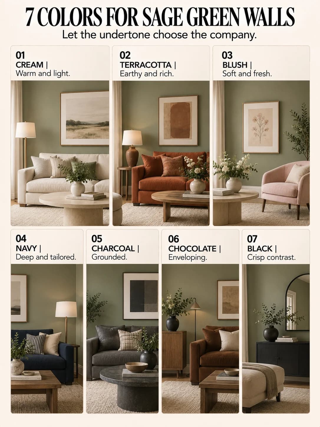
Warm sage is comfortable with cream, terracotta and walnut. Blue-green sage can carry navy and charcoal. A grayer sage often suits blush, mushroom and soft black.
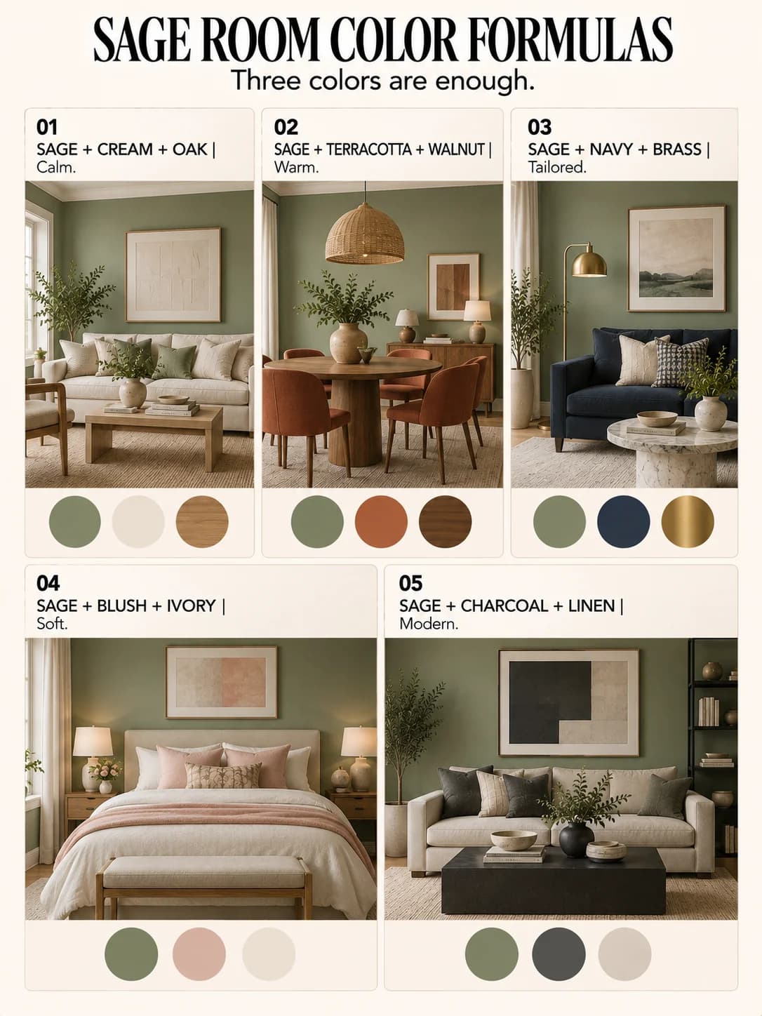
Cream and oak: the room exhales
Cream trim or upholstery softens sage without creating a sharp edge. Oak and woven fibers continue the warmth. Use black in small amounts, perhaps a lamp, frame or table leg, to give the pale palette an outline.
If the oak in the room is distinctly golden, our honey-oak color guide explains why the fixed wood undertone should be part of the first decision, not the last apology.
Terracotta and walnut: more depth, less spa
Sage can drift toward polite wellness waiting room when every companion is pale. Terracotta gives it warmth and walnut adds density. Keep an ivory textile nearby so the room still has a light resting place.
Blush and ivory: soft without becoming sugary
Choose a dusty or brown-based blush rather than a bright candy pink. Ivory bridges the colors. This palette works especially well with gray-green sage and matte fabrics.
One blush chair or pair of pillows is enough. The wall is already a color. It does not need a supporting cast of twelve pastels.
Navy and brass: a sharper direction
Navy creates depth beside blue-green sage. Brass warms the cool pairing and catches light. Repeat navy at least twice, such as a chair and frame, so the dark color does not look accidental.
Charcoal and linen: the quiet modern version
Charcoal is softer than black but still gives the wall structure. Natural linen keeps the room from turning cool and flat. Add medium wood for another temperature shift.
| Option | Best with | Effect |
|---|---|---|
| Cream + oak | Warm and light | Yellow or balanced sage |
| Terracotta + walnut | Earthy and rich | Warm sage |
| Blush + ivory | Soft and fresh | Gray-green sage |
| Navy + brass | Deep and tailored | Blue-green sage |
| Charcoal + linen | Grounded and modern | Cool sage |
| Chocolate + cream | Enveloping | Medium warm sage |
| White + black accents | Crisp and graphic | Clear lighter sage |
Chocolate and cream: the enveloping version
Chocolate brown furniture looks rich against medium sage, particularly when cream appears in curtains or a rug. The combination uses the same earthy logic as olive green with chocolate and cream, but the wall color occupies much more of the room.
Test the actual materials
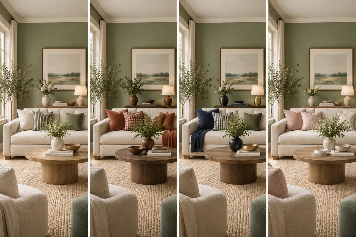
Paint swatches are only half the test. Put the curtain fabric, wood sample, sofa cushion and metal finish beside the wall. Photograph them during the day and at night.
Different woods can coexist; mixing wood tones works best when one family leads and another repeats. The same is true of color. Give sage a clear companion, then let the smaller accents support it.
Frequently asked questions
What neutral goes best with sage green walls?
Cream and warm white are the easiest for warm sage. Greige, mushroom and soft charcoal can work with grayer sage.
Does gray furniture work with sage green walls?
Yes, especially when the sage has a gray undertone. Add warm wood, brass or cream if the room begins to feel too cool.
What wood tones work with sage green?
Oak, walnut, medium brown and pale ash can all work. Choose based on the paint undertone and repeat the wood family more than once.