Two prints can share a color and still look much busier together than you expected. The usual “one big, one small” advice only gets you part of the way.
A small print can be dense and sharp. A large one can have plenty of quiet background. Before deciding your pieces clash, look at what is actually competing.
Start with one printed garment and a small printed accessory
If two printed garments feel like a lot, use a smaller second print first. Try a black-and-ivory striped top with solid black trousers and a small dotted scarf that repeats those colors.
The scarf adds a second pattern without covering another large part of the outfit. Keep it folded narrowly to begin with. Open it wider if you want the dots to have more presence.
That gives you a useful first lesson: the amount of print you show changes the combination, even when neither print changes.
You can do the same with patterned shoes or a small bag. Choose one entry point, then assess it with the outfit you already intended to wear.
| Variable | Look at | One useful adjustment |
|---|---|---|
| Shared color | A repeated color visible at outfit distance | Choose a companion print that repeats a visible ground or motif color |
| Motif size | The size of one dot, flower, check or stripe band | Try a noticeably different motif size while keeping the palette similar |
| Spacing and coverage | How much plain background appears between motifs | Try wider spacing if both prints look dense |
| Color contrast | How sharply the motifs stand out from their own background | Use softer motif-to-background contrast in one print |
| Visible area | How much of each printed piece you can see | Reveal a narrow panel, collar or cuff beneath a solid layer |
Find a shared color you can actually see
A repeated color gives the eye something familiar across two different patterns. It may be the background, such as ivory in both a stripe and floral, or a motif color, such as black lines repeated in dark leaves.
Look from normal mirror distance. A tiny green speck that only appears when you inspect the fabric close up may not provide the connection you expected in the full outfit.
Try: a black-and-ivory stripe with an ivory-ground floral containing black and muted rose. The ivory connects the backgrounds; black connects the pattern marks. Keep the shoes solid while you decide how you feel about the two prints.
Shared color is a useful starting point, not proof that the pairing must feel calm. A black-and-white stripe and a black-and-white checkerboard can still be a very graphic combination. Keep that energy if you like it. If you want less, check the next variables.
Separate motif size from spacing
Motif size is the size of one flower, dot or other repeated shape. Spacing is the background between those shapes. You can have large flowers far apart or large flowers packed tightly together; they will not create the same surface.
The comparison below keeps the striped top, skirt cut and black-and-ivory palette fixed.
Left: larger dots with plenty of ivory between them. Center: smaller dots, spaced so a similar share of ivory background remains visible. Right: those same small dots packed more closely together.
Compare left with center to judge size while the proportion of plain background stays similar. Compare center with right to judge spacing at the same dot size. The fabric details below the outfits show the patterns more clearly, at the same enlargement. They are illustrations of the differences, not measurements of a particular textile.
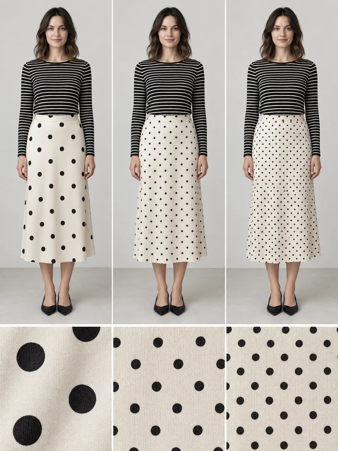
This is why a small print is not automatically the quieter partner. If its marks cover most of the surface, it can remain visually active. A small, low-contrast print may blend from a distance, while a sharp black-and-white version stays more distinct. Check the whole outfit as well as the close-up.
You do not need a precise ratio between the sizes. Try a clearly different scale if both pieces seem to compete, then judge whether that change actually gives you the result you wanted.
Compare contrast inside each print
Two patterns can have similarly sized motifs and still feel different because their marks stand out by different amounts against the background.
Black dots on ivory have a crisp boundary. Warm taupe dots on the same ivory look softer. The size and spacing can stay exactly the same while the pattern becomes less prominent.
In the next comparison, only the skirt’s dot color changes. The striped top, ivory skirt background, dot layout and shoes stay fixed. Notice how much attention remains on the skirt when its dots become softer.
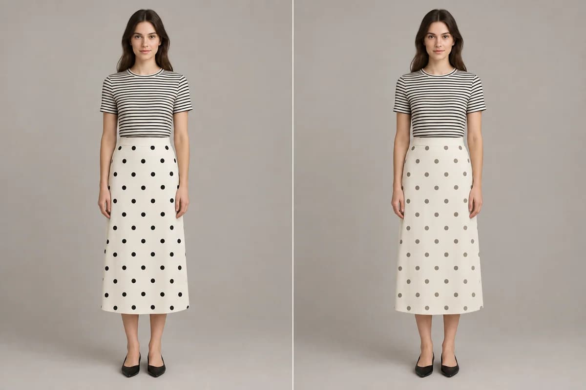
Use this when: you like two prints together but want one to take a supporting role. Look for a companion piece whose motifs are closer in color to their own background. That can be a more useful change than automatically finding a smaller print.
A strong contrast is not a mistake. It simply produces a different outfit from a soft contrast. Decide which one you were trying to make.
Keep both favorite pieces and show less of one
Sometimes you are happy with the colors and prints, but there is more of both on display than you want. Before giving up on the combination, change the visible area.
Add an open solid cardigan or jacket over a printed top. Let a narrower strip of the top show through the middle, with its collar or cuffs visible if you like them. The second print remains, but it takes up less of the outfit.
In the comparison below, the floral blouse and dotted skirt are identical in both views. Adding an open ivory cardigan covers part of the blouse. It does not replace either print or require a new version of either garment.
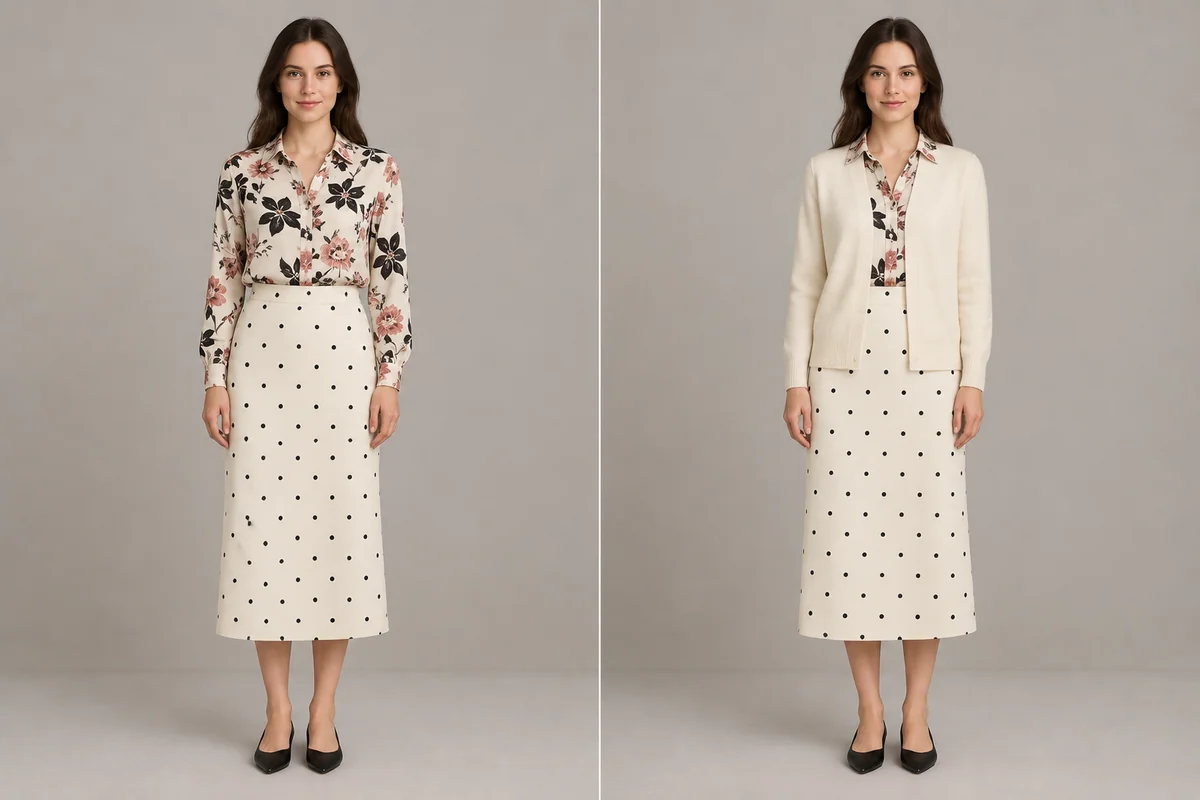
You can also fold a printed scarf more narrowly or wear a printed shirt under a plain sweater with the collar showing. Use a layer already in your wardrobe that suits the conditions. The point is to edit exposure, not add fabric you do not want to wear.
Choose the smallest change in the mirror
Put on the two printed pieces with simple shoes and accessories. Pick the print you would like to notice first, then look at the outfit from a few steps away.
If both prints have hard, distinct edges, try softer contrast in one. If both surfaces feel packed, try a companion with more open background. If you like the prints themselves but feel surrounded by them, reduce the amount of one that shows.
Keep the other decisions steady while you compare. Swapping the shoes, blouse, belt and skirt at once may give you a good outfit, but it will not tell you which change helped.
Frequently asked questions
Can I mix two prints of the same size?
Yes. Similar motif sizes can still look different if one print has more open background, lower contrast or less visible fabric. Judge those features separately instead of treating equal scale as an automatic clash.
Can I wear stripes and florals together?
Yes. Try repeating a stripe color within the floral or its background. Then choose whether the stripe or floral should draw more attention. A sparse floral and a dense floral can behave differently beside the very same stripe.
Can I mix two animal prints?
Yes. Begin by comparing their background colors and contrast, then the size and spacing of their markings. Showing one as a shoe, scarf or small panel can make the combination easier to assess before using two large garments.
Do mixed prints need a solid piece between them?
No. A solid layer or belt can create a pause, but it is optional. Try the prints directly beside each other first. If you add a solid piece, choose it for the effect you want rather than assuming every printed outfit needs a divider.