The rug has a pattern. So do the curtains you love. The room does not necessarily need one of them removed. It needs a clearer distinction between what draws attention first and what supports it.
When mixing patterns in a living room, start with the patterned item you are keeping, repeat a color from it, and vary the visual strength of the other prints. Motif size matters, but so do contrast and the amount of surface each pattern covers. Three prints of different sizes can still compete if all three are equally loud.
Choose the anchor from the room you have
Look at the room from its usual entrance. Which patterned surface is most prominent there? A large rug may be the anchor because of its area. Floor-length printed curtains may dominate because they frame the daylight. A favorite patterned chair might be the piece you most want to preserve, even if it is smaller.
Choose one of those as the starting point and identify a color you would enjoy repeating. It can be a quieter color inside the print rather than its darkest outline. You do not need to reproduce the entire palette in every cushion. A small repeat can connect two fabrics while allowing them to look different.
Keep the existing plain surfaces in the discussion. A solid sofa, wall or curtain panel gives the prints a background. Replacing every plain surface with another coordinating pattern can remove the contrast that made the first print appealing. A room does not earn extra marks for using all the fabrics in the sample book.
Scale, contrast and area do different jobs
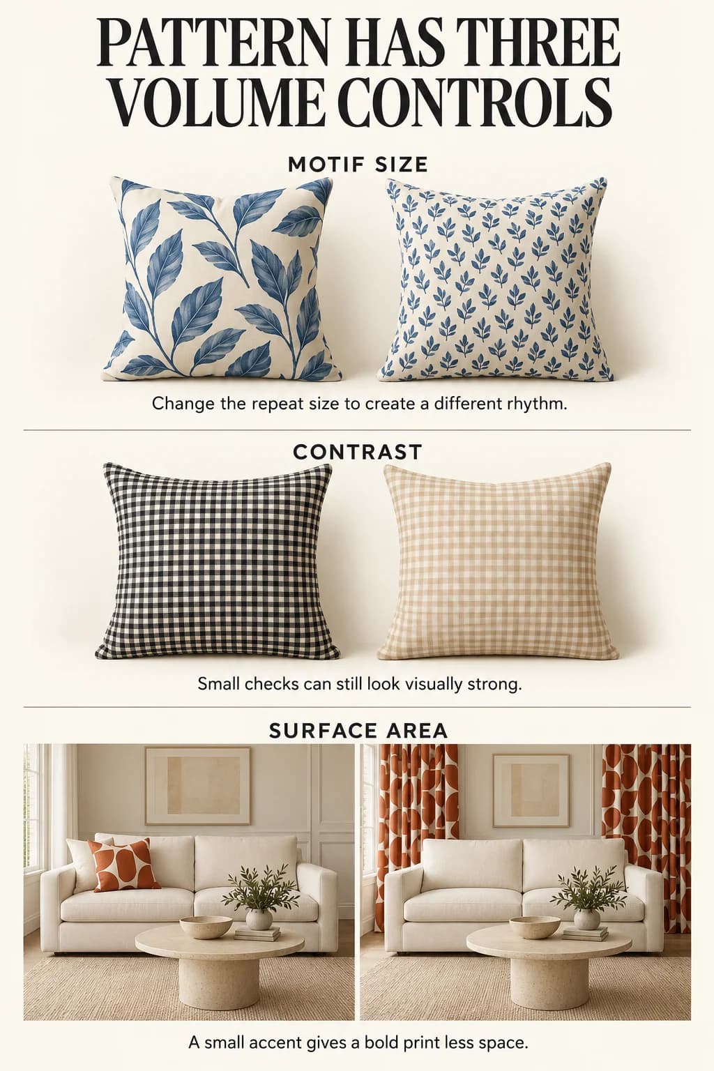
Scale describes the size of the motif. A large leaf and a fine stripe have different rhythms. Compare the actual repeat in a fabric sample, not only a small online thumbnail: a cropped image can make a large pattern look much smaller than it is.
Contrast describes the difference between the colors inside that motif. A tiny black-and-white check can catch attention more sharply than a large pale-tan leaf on cream. Calling the check a small print does not make it a quiet one.
Area describes how much of the room carries the pattern. A bold cushion occupies less space than curtains covered in the same motif. Moving a strong print to a smaller item can change the balance without abandoning the print itself.
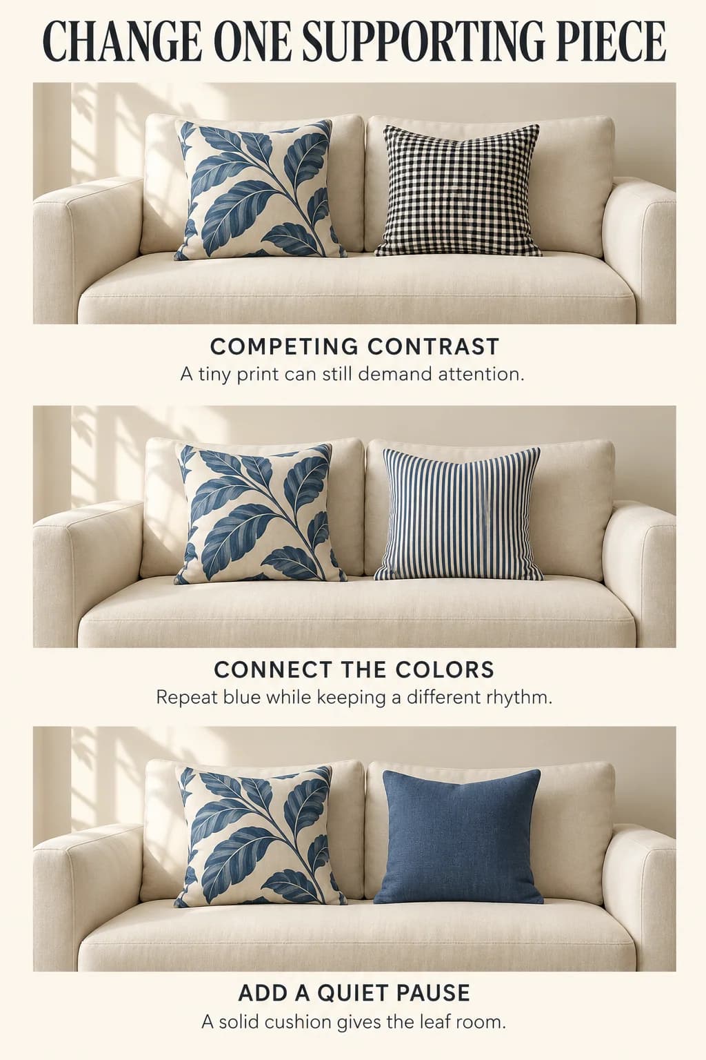
To see the distinction, imagine a cream sofa with a blue-and-cream leaf cushion beside a black-and-white check cushion. Leave the leaf unchanged and replace only the check with a blue-and-cream fine stripe. The scale is still small, but the supporting colors now relate to the leaf. If the pair remains too active, try a plain blue cushion instead. One adjustment at a time tells you which change helped.
These are editorial starting points, not a mathematical room formula. Room & Board's pattern guidance also separates size and density, while Ballard Designs' pattern guide suggests balancing a bold print with smaller, quieter patterns or solids. Neither requires you to discard a room that you already enjoy.
Two rooms that begin with different commitments
Keep the patterned rug; quiet the large upholstery
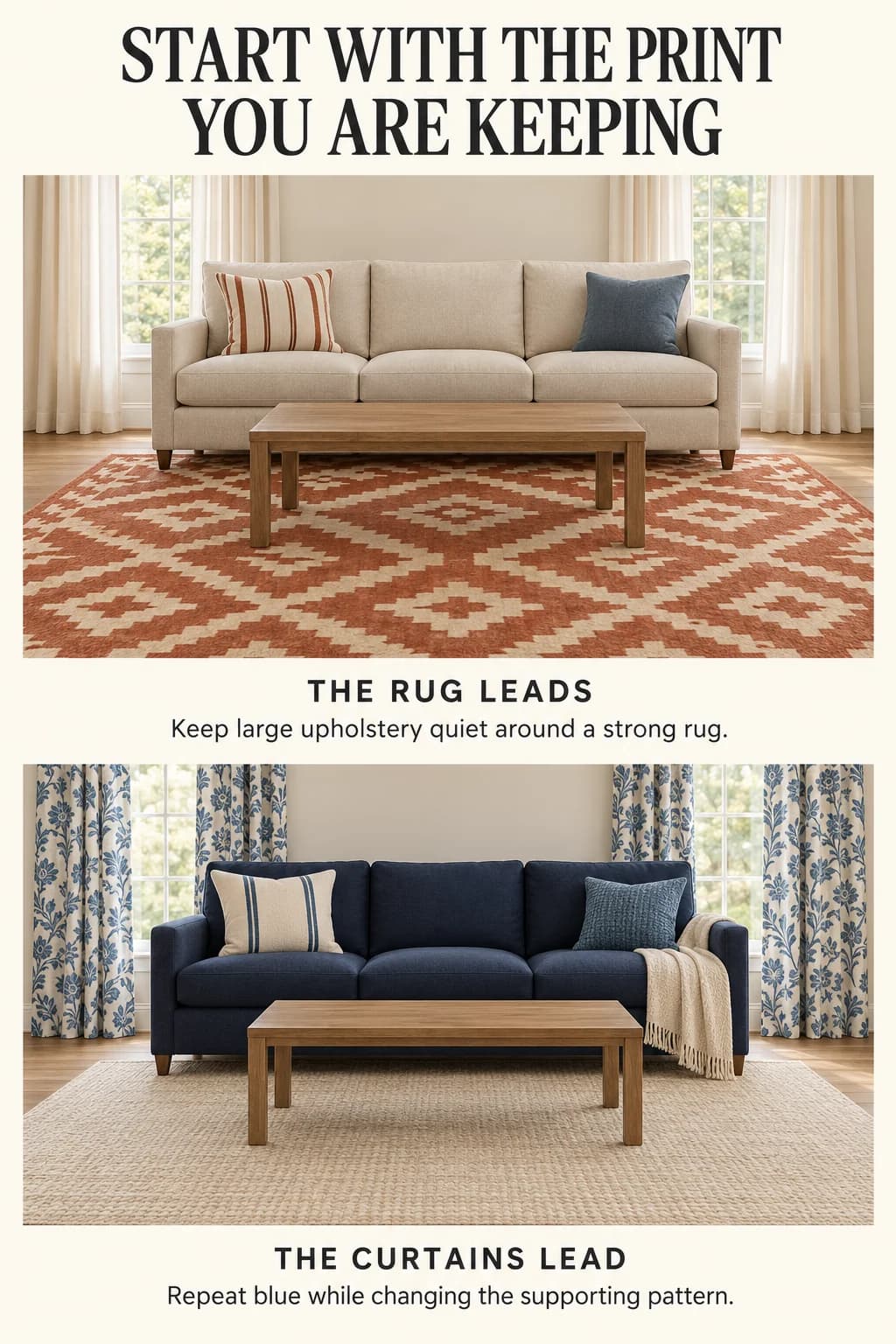
Suppose you own a rug with a broad rust-and-cream geometric design. Place a plain oatmeal sofa on it, then use two supporting cushions: one with a narrow rust stripe on cream and one in a solid muted blue. The stripe repeats a rug color in a much finer rhythm; the blue creates a separate accent without adding another motif.
Use plain cream curtains so the rug remains the broadest patterned surface. A wood coffee table and a simple textured throw can add material variation without another printed layer. This is a useful approach when you like a strong rug but do not want the entire room to have its energy.
If the sofa is already dark brown, retain it and compare the cushion fabrics against that darker background. A cream cushion may stand out much more than it did on oatmeal. You might keep only one light patterned cushion and use a solid rust companion. For placement that leaves actual sitting space, see arranging throw pillows on a sofa.
Let the printed curtains lead instead
Now imagine blue-and-cream botanical curtains, a plain navy sofa and an existing light neutral rug. Keep those larger pieces. Add a cream cushion with a widely spaced blue stripe and a smaller plain blue cushion in a different weave. The curtain's organic shapes and the cushion's straight lines feel distinct, while their shared colors connect them.
Choose a quiet throw rather than another botanical print. If you have a patterned armchair too, place a real swatch of its fabric beside the curtain sample. Ask whether it introduces a useful change of scale or repeats the same busy rhythm. There is no need to replace the chair merely because it is patterned; try simpler cushions first.
For a softer version of this room, use a plain cream sofa and keep the navy as a smaller cushion or throw. For a room viewed through an adjoining dining space, consider the other rug in that sightline before adding more floor pattern. The guide to coordinating rugs in an open floor plan addresses that wider relationship.
Change the supporting print before the whole room
If every surface seems to demand attention, remove one movable patterned item and look again from the doorway. A solid cushion or throw can create a pause between a rug and curtains. If removing it makes little difference, the stronger competition may be between the large surfaces; sample a quieter curtain treatment before buying another rug.
If the patterns seem unrelated, look for a color you can repeat in one small piece. Repetition need not be exact matching, but a warm cream and a sharp white may produce a contrast you had not intended. View physical samples together in the room's daylight and evening light. Screen images are useful for narrowing choices, not for deciding how two actual fabrics will look together.
If the mix feels dull despite several patterns, you may have chosen prints with very similar scale and contrast. Try one more distinct motif on a small removable piece. This gives you a limited experiment rather than a commitment to new upholstery.
For a small or rented room, start with one cushion cover or a throw. Keep the larger furniture and window treatments fixed while you compare it. You can use two patterns, several patterns or one pattern with textured solids. The useful result is a room whose relationships make sense to you, with enough space left to sit down.