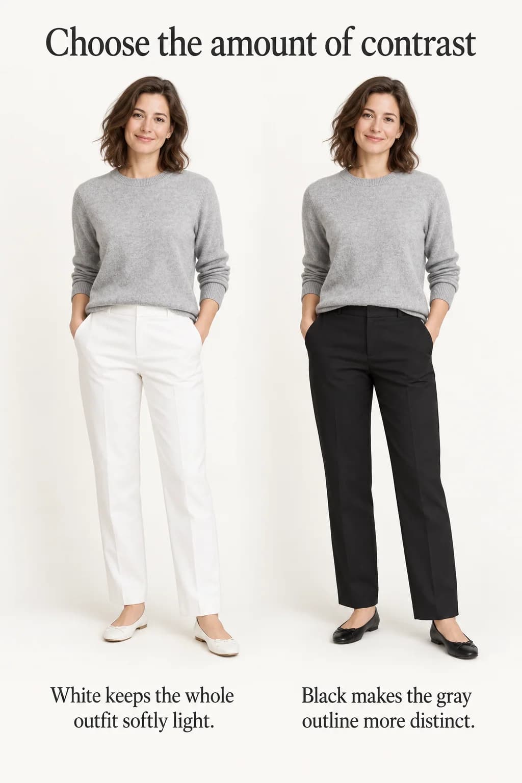
Put a pale-gray sweater beside white trousers, then beside black trousers. Both combinations can work, but they ask the sweater to do different things. Against white it becomes part of a soft, light outfit; against black its outline becomes much clearer. That difference is more useful than a long list of colors that supposedly match gray.
Read the gray before choosing its partner
Gray clothes range from nearly white to nearly black, and some look blue, brown or green beside other garments. Start by laying the actual pieces together in daylight, then check them in the light where you will wear them. Product photographs and color names cannot settle a close match for you.
Pale gray leaves plenty of room for a darker partner. Charcoal already supplies depth, so a lighter top or small bright accessory can be enough. Mid gray is adaptable but can disappear among several other mid-tone pieces. If an outfit feels indistinct, compare a lighter or darker item before deciding that you need a new accent color.
Treat warm and cool undertones as observations, not prohibitions. A brownish gray can look good with pale blue; a cool gray can work with cream. The question is whether you like the relationship in those fabrics. Texture, shine and the amount of each color also affect what you see.
Pale gray, navy and white for a clear daytime outfit
Begin with a pale-gray crew-neck sweater, navy straight trousers and white sneakers. A white T-shirt showing only at the neckline repeats the footwear without introducing another strong color. Use a navy bag if you want the gray sweater to stay the lightest large area.
This works for a walking lunch or an informal day because the navy establishes a clear lower outline while the white keeps the outfit from feeling uniformly dark. The sweater can stay untucked if its hem falls cleanly above the fullest part of the trousers. A small tuck is optional; it changes the visible waist more than the palette.
To make the combination more polished, swap the sneakers for navy loafers and use a white shirt under the sweater. Leave only as much collar and cuff showing as feels comfortable. If white looks too stark beside your knit, compare an ivory shirt and cream shoes together. Changing both repeats makes the warmer light color look intentional without requiring a new gray garment.
Black shoes are another option. They will add a third dark tone rather than “clash” automatically; our guide to navy and black together explains how to judge that closer relationship.
Charcoal, pale pink and black when you want softness with definition
For dinner or a relaxed office, wear charcoal tailored trousers with a pale-pink blouse and black flats. The pink occupies a large light area, while the black footwear gives the trousers a definite finish. A charcoal cardigan or jacket can add warmth without making the pink compete with a second accent.
Keep the blouse's shape in mind. A fine blouse tucked into trousers gives a different effect from a roomy shirt worn loose. Either can support the colors; choose the version that sits comfortably after you have been seated. A muted rose top may feel easier than a very pale pink if the pale shade almost disappears against the gray.
If you like pink but dislike it near your face, wear a charcoal top with the trousers and move pink to a scarf carried on the bag, a small bag itself or the shoes. That is a smaller, more contained accent. It will not create the same light upper body as the blouse, so leave a little white at the neckline if you want additional separation.
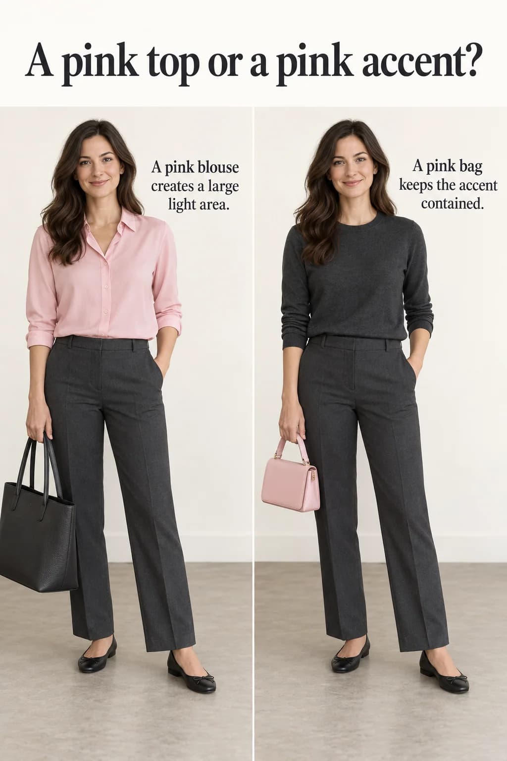
The amount of color is a styling choice in its own right. Holding the charcoal base fixed and comparing a pink blouse with a pink bag shows why “gray and pink” can describe two very different outfits. Neither needs a matching pink manicure, belt and earrings to make the pairing understandable.
Mid gray, burgundy and brown for a richer combination
Try a mid-gray fine-knit top with a burgundy midi skirt, chocolate flats and a chocolate shoulder bag for a weekend gathering. The burgundy is the main color, gray creates a quieter upper half and brown keeps the finish warm. A gray top that is noticeably lighter than the skirt gives the pieces more separation than a very dark gray would.
Let a short knit meet the skirt waistband, or tuck a thin hem only if it does not show through the skirt. On a colder day, dark-brown boots can replace the flats; check that the skirt moves over the boot shafts. A gray coat can repeat the top, but compare the two grays together before assuming they match.
If gray and burgundy look heavy in the available light, add a small ivory collar or change to a lighter gray top. If you prefer a sharper finish, use black footwear and a black bag instead of brown. The burgundy color guide offers further combinations when the burgundy piece, rather than the gray one, is your starting point.
When several grays look accidentally mismatched
A gray jacket and trousers in almost the same shade can resemble a suit that failed to match. You have three practical options: use pieces made as a suit, separate the shades more clearly, or make the difference in texture obvious. A smooth charcoal trouser beneath a fuzzy light-gray knit reads as a deliberate contrast even though both are gray.
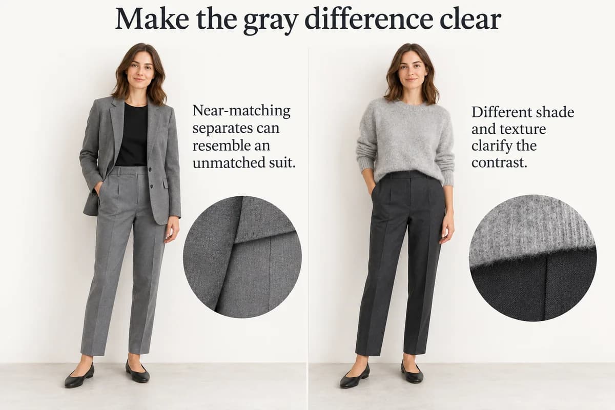
Try removing one gray layer before replacing the whole outfit. If the remaining pieces work, the problem may be that extra near-match, not the entire palette. A navy or cream layer can create a cleaner distinction using something already in your wardrobe.
A fully tonal outfit can also be lovely. Keep it tonal because you like the softness, rather than trying to make several unrelated grays pass as identical. Look at the outfit from a few steps away, then close enough to see the materials. If it has the amount of contrast you wanted at both distances, there is no need to add a bright accessory simply because gray is often called a neutral.